
Last month I had the opportunity to create some artwork on behalf of Financial times as part of a ‘Make sense of it all’ pop-up gallery on Cork Street for the Frieze London. The topic for the map art was to visualise where people had migrated to due to the ongoing war in Ukraine. This is obviously an incredibly sensitive topic for many people and also a difficult concept to map - I wanted to make sure I was creating artwork that was both insightful and beautiful without compromising or sensationalising a topic for the sake of 3d art.
I’ve shared some visuals of the map which went on display a few weekends ago but I didn't explain the thought process and design workflow that went into creating the map. This blog should hopefully shed some light on the design iterations and how the map evolved throughout the project.
First Steps:
As the war unfolded in Ukraine the migration maps began to populate Twitter and other social spaces, I found these fascinating both the varied approaches and thought processes behind ‘how to map movement.’ It's an incredibly difficult concept to convey in a static image, the very nature of movement involved motion and I have airways thought it best visualised as an animation. However, this installation needed to be a static image within a lightbox so I first took stock of the mapping already created for the Ukraine migration.
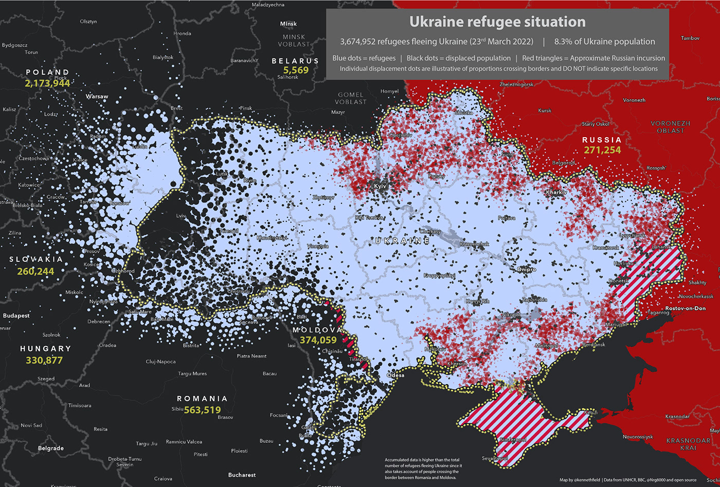
There was a pretty varied approach to this by journalists and cartographers alike -, some preferring simplistic scaled symbol maps like Jonni Walker and The FT themselves.

And some tried a more experimental approach like Ken Fields abstract depiction of the movement of people.
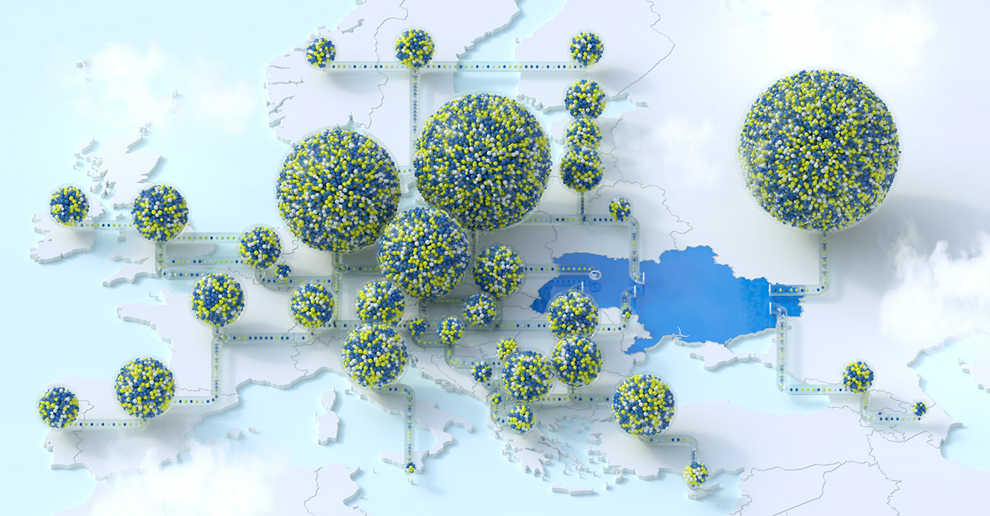
I guess I wanted something in the middle of these two approaches, it had to be innovative but also simplistic enough to appreciate the scale of migration, in an instant. My initial thought was to use spheres to represent people and the movement of people into other countries. I have used many sphere-based concepts to visualise volumes of metrics in the past, like the example of buses below, but was very careful to not go down the route of organising spheres into piles. This would be an incredibly insensitive thing to do when dealing with human-data.

The Data:
The data came from https://data.unhcr.org/en/situations/ukraine, which is an Operation Data Portal with updated statistics on the number of refugees from Ukraine recorded in various countries.
I wanted to keep the visualisation simple so only focussed on the total number of refugees taken at the time the project started. There is quite a lengthy workflow to the idea I had in mind so it would be tricky to update constantly. I also think the general ratio of people spread out through countries should stay similar over the course of a month so I don’t think there would be much variation here.
The Visuals:
My very first iteration was quite far from where the map ended up but still used the same concept of spheres within spheres to represent people. I initially wanted to go down a very abstract route but without geography and context this depiction of data becomes very confusing. But it’s an interesting start to conceptualise how I could show the volume of people over a given geographical region.

I wanted to use the concepts built by many on the migration maps I looked at and add my 3d take to it. So this started with proportionally scaled orbs filled with spheres that represented a number of people. These spheres would then sit over the top of the countries they represented as per the below following iteration.

I initaly keept the base mapping simple and had the data do the talking. Each of the countries receiving people had spheres the colour of the Ukrainian flag and the giant sphere in the centre of Ukraine represented the volume of people displaced by the war. This soon became a problem - the overly large Ukrainian sphere couldn’t fit all the smaller spheres in at the same size as the receiving countries so they had to be made smaller which was a little confusing. There is also a ton of occlusion with the Ukrainian sphere blocking other data.
The below version without the Ukraine data was simpler whilst still retaining the overall message.

So this became my starting point for iterations - the element that was missing was some concept to show the direction of movement. I initially started with glass arcs for this, something that wouldn’t obscure the data too much but show the connections to Ukraine. The arcs tapered towards Ukraine showing a direction of movement. This was soon scraped through as the movement corridors weren’t as binary as x -> y and involved a fair bit of inter-country flow.

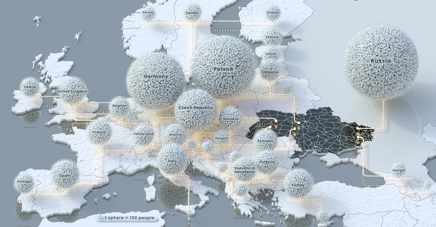
So the next iteration was to build on this movement corridor concept. I decided to ‘ground’ the corridors and create an abstract and generic corridor network through all of the countries. This would serve as an indication of flow but the reality is it is very difficult to track exact journeys. The glass network complete with entrance arcs in Ukraine and a network of smaller spheres without the glass tubes was a lovely way to show people moving from Ukraine.

The problem still remained that direction wasn’t being shown and would be difficult without some sort of arrow, something I wasn’t keen on doing. Short of animation I ended up settling on the fact that we would have to describe what was happening through a map title or description under the map. I did have some initial tests at animating the data but was unable to fully complete the concept accurately and so ditched it early on.
Iterating & Evolving:
The initial map was sound in concept and I think illustrated the scale of migration well but when discussing with The FT we concluded that it was a little too clinical with its glass network and, despite being Ukraine flag colours, the blues and yellows created a kind of medical feel to the overall map.
So I started experimenting….
First thing was to build out the base mapping a bit more, this involved adding roads, urban areas and labels. I initially like the idea of adding in clouds too but I think this was a little too gimmicky so it didn’t make it through to the final version


During the initial design, I also experimented slightly with whether having lots of tiny spheres within one big glass sphere was confusing and so I produced a number of different examples using solid spheres and half-domes too….


I did also like the idea of a night-time view of the data with the spheres lighting up and refracting off the glass domes however it was a very difficult concept to understand and the emissions ended up confusing the overall design. Still, it looks pretty….

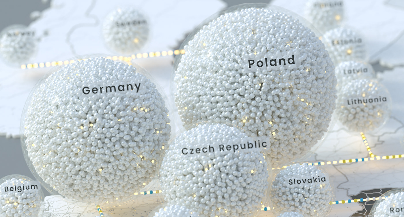
We ended up agreeing that a more muted colour palette was best and decided to iterate on the below map which I was happy with. Keeping the map simple was key of course and the addition of a little plaque indicating 1 sphere = 100 people gave the map some weight in terms of a metric for visualising the volume of people. The actual number of spheres is correct but the workflow is quite technical and involves a ton of ‘sphere-packing’ nodes which probably won't be of interest. Suffice it to say I learnt a lot about proportional volumes of spheres during the process!

We did still want to include some light in the mapping to draw people's attention to the flow of data as the above image is quite muted and subtle. The below were some of my experiments in lighting up the data subtly.


The Final Version:
And voila, the final version is the one below complete with some nice close-ups. Some tweaks that went into the final iteration were as follows:
* Less reflectivity on the sea
* Glowing inner tube connecting the network
* Ukraine flag colours showing the movement of people along the network
* Random emissive spheres within the country orbs to show them sparking slightly
* Large orbs at the beginning of the network to show data starts here
* No clouds.


It was incredible to see the work come together and the *huge* lightbox populated with all the map images I had created. This was an incredibly difficult topic to design a ‘beautiful’ map for, in the past I have been reluctant to map quite serious topics in the way I do because the nature of my work involves creating beautiful imagery and turning a horrific topic into something cinematic often does the topic an injustice. However, I thought 3d mapping actually helps gain insight here, once you know what is being displayed it becomes quite a simple concept to ingest.
I hope this blog gave some insight into the thought process behind the map and hope to produce more concepts like this in the future!


